In a world that often feels haywire — chaotic, disconnected, too loud to hear our own hearts — we wanted to create something different. Something gentle.
Hawire is a sacred space for couples to slow down, feel safe, and reconnect. Not through pressure or perfection, but through presence, softness, and quiet truth.
The name may echo “haywire” — and that’s no accident. Many of us arrive here feeling a bit like that: tangled inside, overwhelmed in love, unsure how to be close without losing ourselves. But Hawire is a soft turning point — a place where disconnection can become intimacy, where noise becomes listening.
⸻

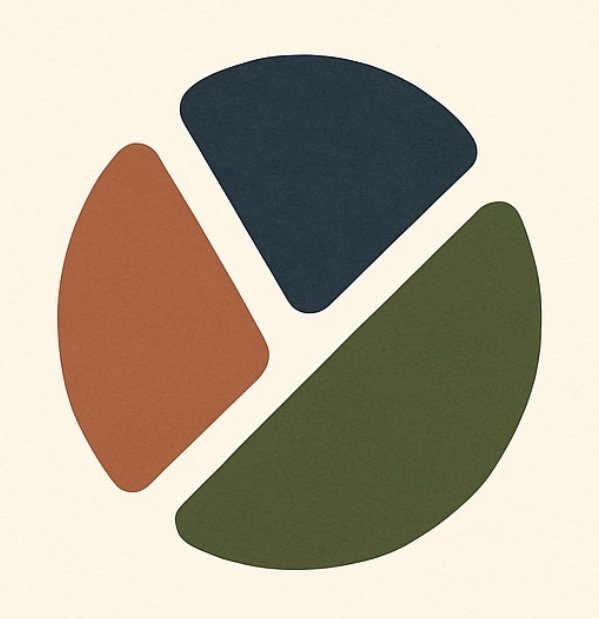
Our logo is made of three rounded triangles — representing the harmony between:
• One partner
• The other partner
• And the sacred space between them
Together, they form a soft “Y” in the middle. That shape is a fork in the road — a quiet invitation to choose deeper connection. It’s also a vessel — a symbol of holding space with care.
Each color carries its own energy:
• Midnight Blue: trust, depth, and presence
• Clay: warmth, humanity, and emotional honesty
• Olive: peace, growth, and grounding
• Cream: the soft foundation — where love feels safe again

